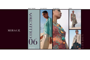
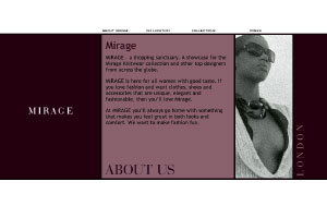
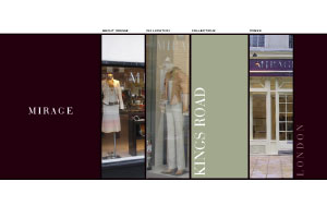
the brief: This was a fun site to do. It was designed for St Saviours. The existing site used flash to show the current collection, but it hadn’t been updated since 2004. After discussing a facelift, the client decided to go for a full redesign. The site needed a modern and fashionable look, to go with the clothing it offered. A current business card, in rich purple and silver was almost the only reference point.
the result: Flash has a lot of functionality, but it’s not as easy to quickly update. So I used css, javascript and html to get some slideshows, and fading mouseovers working, in a way that replicates some of the nice aspects of flash.


