Gordon’s Gin
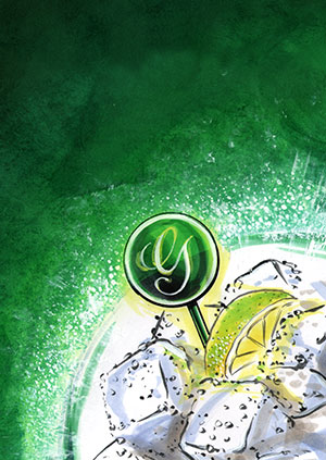
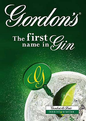
Done while working at Carlson, this brief was to cover the below the line look and feel for Gordon’s Gin. The illustrated image was for the pitch – which we won. We then covered all the various areas of in-pub communication. The photography was done by Patrice de Villiars, and the retouching and comping together by Lightbox.
One of the most pleasing aspects of this job for me was the way the initial idea remained true to my designs, as well as the fact that it remained undiluted by too much input – I was the sole creative working on this through most of it (other than some copywriting).


